1. 基本属性
1.1. oo-style、pyplot-style
oo-style就是面向对象式,一般会创建一个句柄,当需要创建不止一个figure或者axes的时候推荐使用oo-style,另外,oo-style可以用的api更加丰富;
pyplot-style就是直接使用pyplot的内置函数,pyplot-style最大的优点就是简单粗暴,如果只是简单的作图,推荐使用pyplot-style,另外,一般pyplot-style的设置都是全局性的。
1.2. 基本组成成分
1.2.1. Artist
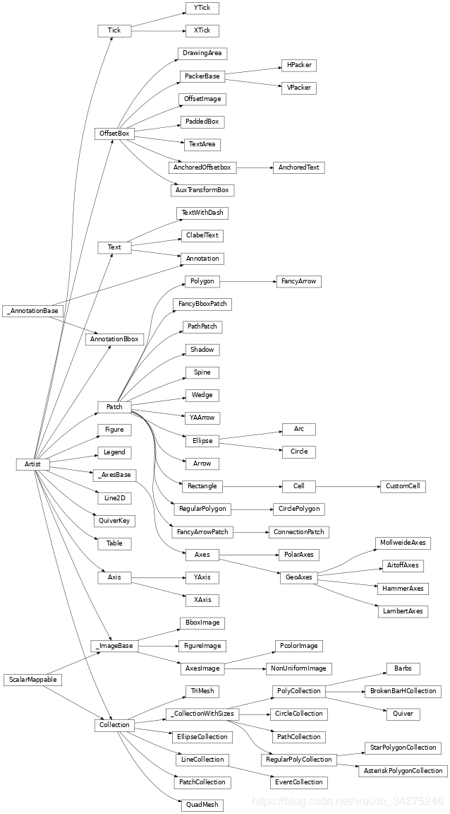
Artist是matplotlib最大的基类
基本上,你能在图形上看到的一切都是artist (甚至是图、轴域和轴对象),这包括文本对象、Line2D对象、集合对象、补丁对象等等
Artist对象的所有属性基本都通过相应的get_*和 set_*函数进行读写
1.2.2. Figure、Axes
Figure是画布,由Artist对象创建,且是最大的Artist对象
axes是画像,由Figure对象创建,一个画布里面可以有多个画像
1.2.2.1. 创建Figure、Axes
# 方法一
fig, ax = plt.subplots()  # a figure with a single Axes
fig, axs = plt.subplots(2, 3)  # a figure with a 2(height) x 3(width) grid of Axes
ax = axs[0, 0]

# 方法二
fig = plt.figure()
ax = fig.add_subplot(2, 3, 1)
ax = fig.add_axes([left, bottom, width, height])  # 可以在任意位置创建一个指定大小的画像,其中的数值为占比

# 方法三
# 实际上,这种方式会默认新建一个figure,但这个figure的句柄,我们是拿不到的
ax = plt.subplot(2, 3, 1)
ax = plt.gca()
1.2.2.2. 设置Figure
# 调整子图与边缘间距、子图与子图的间距
plt.subplots_adjust(left=0.05, right=0.95, bottom=0.05, top=0.95, wspace=0.5, hspace=0.5)

fig.set_facecolor('papayawhip')  # 设置画布的背景颜色,这是一种我比较喜欢的背景颜色,一种类似于纸张的颜色
1.2.2.3. 设置axes
下面是oo-style的设置语句
ax.set_title("Simple Plot")  # 设置画像名称

ax.grid()  # 添加网格线
ax.set_facecolor(color)  # 添加axes背景颜色

# 下面只列举x轴的设置,y轴设置类似
ax.set_xlabel('x label')  # 设置x轴名称
ax.set_xlim(left, right)  # 设置x轴范围,如果right>left,坐标就会从大到小显示

# 统一设置x轴的刻度
ax.set_xticks(x)  # 设置x轴刻度,使每个刻度的距离一样,例如,[0, 1]和[1, 10]的刻度距离一样
ax.set_xticklabels(label)  # 设置x轴各个刻度的显示名称

# 设置刻度、刻度标签和网格线的外观。
ax.tick_params(axis='x',							# 可选参数:{'x', 'y', 'both'}
               labelbottom=False,			# 隐藏x轴底部的坐标轴刻度,四个方位分别为bottom, top, left, right
               labelcolor='r',				# 设置坐标轴、刻度、值为红色
               direction='in', 				# 设置刻度朝里,可选参数:{'in', 'out', 'inout'}
               labelrotation=45,			# 刻度值顺时针旋转45度
               grid_color='r',				# 设置x轴方向的网格线为红色
               grid_alpha=0.5,				# 设置x轴方向的网格线的透明度为0.5
               grid_linewidth=1,			# 设置x轴方向的网格线的宽度为1,这个值是像素
               grid_linestyle='dotted' # 设置x轴方向的网格线的样式
              )

# 批量设置x轴的每个刻度值
# 返回的是一个Text对象
for label in ax1.xaxis.get_ticklabels():
    label.set_color('red')

# 批量设置x轴的每个刻度线
# 返回的是一个Line2D对象
for line in ax.xaxis.get_ticklines():
    line.set_color('green')

# 批量设置图像的每个边框
# 单独设置一个坐标轴的话,使用形如后面的语句:ax.spines['bottom'].set_*
# 返回的是是一个Spine对象
for spine in ax.spines.values():
    spine.set_visible(False)  # 隐藏边框,如果坐标轴也在边框上面,那么刻度和刻度值也会被隐藏

ax.set_axis_off()  # 不显示坐标轴
ax.set_axis_on()  # 显示坐标轴

ax.set_facecolor('r')  # 设置画像的背景颜色为红色
ax.remove() # 去掉画像如果要使用pyplot-style的方式,只需要把函数的set_前缀去掉就可以了,例如,ax.set_xlabel()的pyplot-style表现形式是plt.xlabel()
1.2.3. Text
Text是文本对象生成模块
mathplotlib对非英文字符的兼容性很差,一些显示异常的情况可以如下设置:
unicode字符,例如负号
plt.rcParams['axes.unicode_minus'] = False中文。因为matplotlib自己是不带中文字体,需要导入系统自带的字体库才可以正常显示,有以下三种方法可以解决这个问题
使用系统字体库的环境变量。
这种方法因为Windows和Mac的字体库是不一样的,所以需要分开设置
Windows:
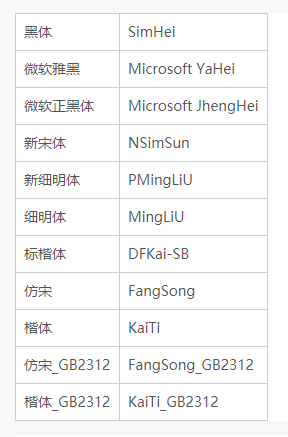
plt.rcParams['font.sans-serif'] = ['SimHei'] # 用来正常显示中文标签其中,更多字体可以查找
%windir%\fonts文件夹,一些可用的文字如下:
Mac:
plt.rcParams['font.family'] = ['Arial Unicode MS'] # 用来正常显示中文标签其中,更多的字体可以通过
command + 空格搜索“字体册”,选择合适的字体,右键-在访达中显示,.tff前面的就是字体的名称了。PS:只有格式为
.ttf的字体文件可以被matplotlib正常使用。导入字体文件的路径。
import matplotlib.font_manager as fm
myfont = fm.FontProperties(fname=r'D:\Fonts\simkai.ttf')
将字体文件复制到matplotlib的
site-packages/matplotlib/mpl-data/fonts/ttf/字体文件夹下面,然后重新加载字体库。from matplotlib.font_manager import _rebuild _rebuild()
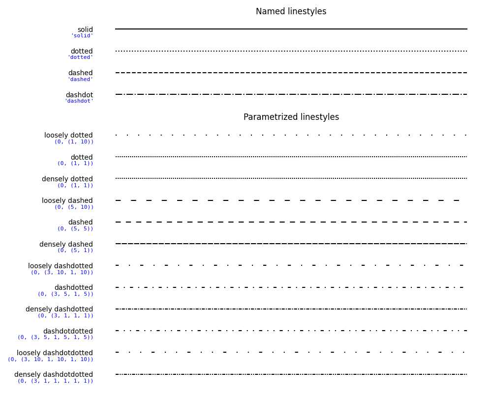
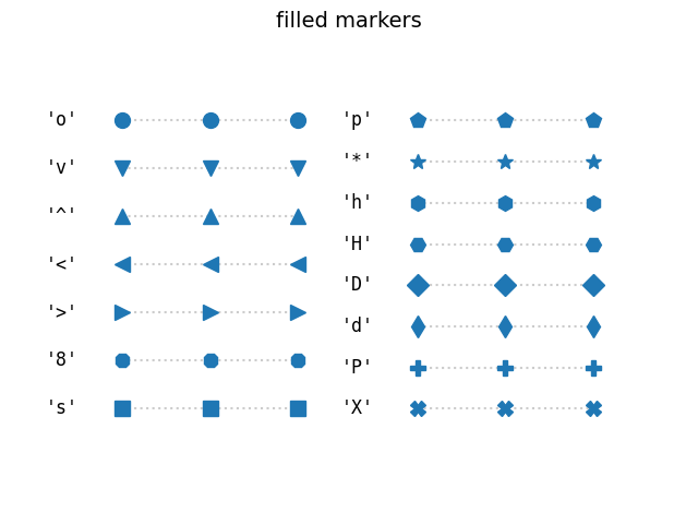
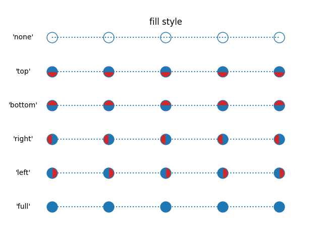
1.2.4. Line2D
Line2D是线类对象描绘模块,图中所有的绘制的线都是线对象
各个样式如下
1.2.4.1. 折线样式
1.2.4.2. 非填充标记点样式

1.2.4.3. 填充标记点样式
1.2.4.4. 标记点填充样式
1.2.4.5. mathtext标记样式

1.2.5. Spine
Spine是边框模块
特别地,只有当坐标轴位于边缘的时候,坐标轴才是边框的一部分
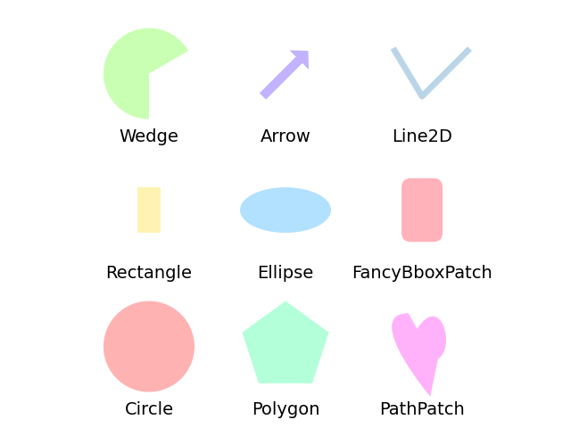
1.2.6. patches
patches是图形绘制模块,其中又包括Rectangle, ellipse, circle, polygon等绘制对象
Axes中添加patch的语句如下(只用添加矩形作为例子)
import matplotlib.patches as mpatches

rect = mpatches.Rectangle((x, y), width, height)
ax.add_patch(rect)
各种patch的样式如下(其中的Line2D不属于patches)
1.2.7. collection
collection是批量图形绘制模块,其中matplotlib.collections.Collection是该模块下最大的对象,可以批量绘制不同的图形。该对象延伸出许多子对象,例如,matplotlib.collections.LineCollection,是专门批量绘制线条的对象。
Axes中添加collection的语句如下(只用添加线条作为例子)
import matplotlib.collections as plc

lines = []
for (x0, y0), (x1, y1) in path:
    lines.append(((x0, y0), (x1, y1)))

lc = plc.LineCollection(lines)
ax.add_collection(lc, autolim=True) # autolim=True enables autoscaling.
ax.autoscale_view() # 自适应调节x、y轴
1.2.8. colors
colors是实现配色映射功能的核心模块
简单来说,配色映射的作用是,把一定区间内的rgb颜色映射到另一个区间内,例如,把 [0, 0.4] 区间内的 'r' 映射以指定的归一化规则映射到 [0, 1] 内。
所以,这个模块分为两个部分,一个是Colormap,一个是Normalize
1.2.8.1. Colormap
映射区间划分模块
| 函数名 | 作用 |
|---|---|
ListedColormap |
均分划分区间 |
LinearSegmentedColormap |
自定义划分区间 |
ListedColormap 使用方法如下
import matplotlib.colors as colors

# 把颜色区间均分为3份
# 即 [0, 256/3] 内颜色映射为 'r' 色
cmap = colors.ListedColormap(['r', 'g', 'b'])
plt.imshow(arr, cmap=cmap)
LinearSegmentedColormap 使用方法如下
cdict = {'red': [(0.0, 0.0, 1.0),
                 (0.4, 0.0, 1.0),
                 (1.0, 1.0, 1.0)],

         'green': [(0.0, 0.0, 0.0),
                   (1.0, 0.0, 0.0)],

         'blue': [(0.0, 0.0, 0.0),
                  (1.0, 0.0, 0.0)]}
cmap = plc.LinearSegmentedColormap('name', segmentdata=cdict)
plt.imshow(arr, cmap=cmap)这里有一个segmentdata参数,这个参数分为rgb三部分,表示rgb各种颜色区间划分规则,segmentdata的阅读规则为
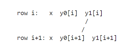
这个表示区间 [x[i], x[i+1]] 的颜色颜色到区间 [y1[i], y0[i+1]] 中,
例如,上面的cdict表示:
对于'red',
[0, 0.4]区间段内,'red’的值从 0.0 线性增加到 1.0;[0.4, 1.0]区间段内,'red’的值为 1.0对于'green' 和 'blue',
[0, 1]区间段内,'green' 和 'blue'都为0,其实就是把'green' 和 'blue'过滤掉了。
当然,最简单就是使用matplotlib内置的颜色区间划分方案,其位于matplotlib.cm模块中
下面列举了一些引用配色方案方法,其作用效果都是一样的
cmap='ocean'
cmap=plt.get_cmap('ocean')
cmap=plt.cm.ocean
1.2.8.2. Normalize
归一化模块
| 函数名 | 作用 |
|---|---|
BoundaryNorm |
离散归一化,映射到整数 |
LogNorm |
log归一化 |
Normalize |
线性归一化,默认值 |
PowerNorm |
pow(x, n)归一化 |
SymLogNorm |
对称log归一化 |
使用方法如下
plt.imshow(arr, cmap=cmap, norm=plc.LogNorm())其实这个模块平时不怎么用得上,知道大概有这么一个用法就可以了
2. 二维图像
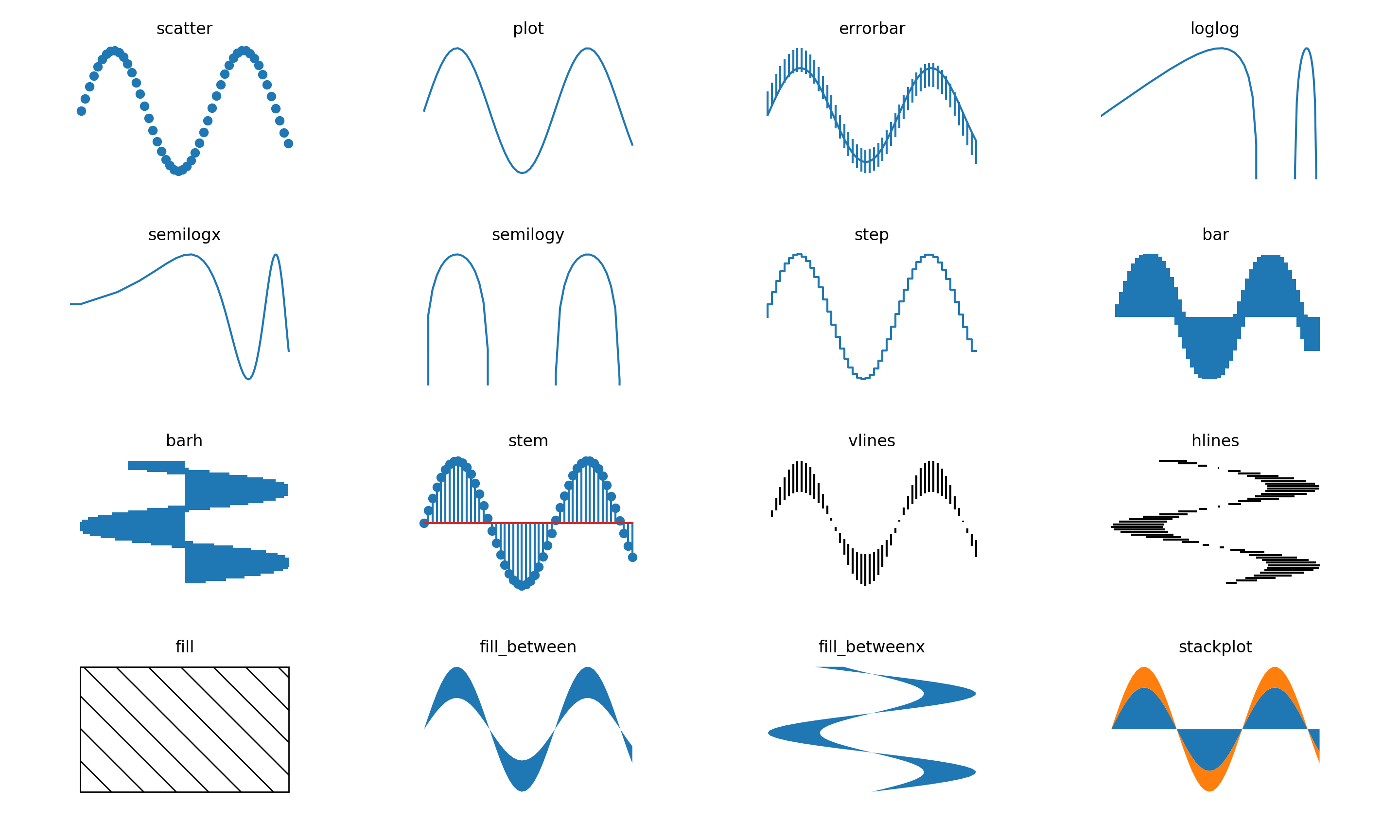
2.1. 常规数学统计图
| 函数名 | 作用 |
|---|---|
Axes.scatter |
散点图 |
Axes.plot |
折线图 |
Axes.errorbar |
带误差区间的折线图 |
Axes.loglog |
把x、y取log对数后的折线图 |
Axes.semilogx |
把x取log对数后的折线图 |
Axes.semilogy |
把y取log对数后的折线图 |
Axes.step |
阶跃函数图 |
Axes.bar |
条形图 |
Axes.barh |
横向的条形图 |
Axes.stem |
火柴图 |
Axes.vlines |
垂直线图 |
Axes.hlines |
水平线图 |
Axes.fill |
任意形状填充图 |
Axes.fill_between |
垂直填充图 |
Axes.fill_betweenx |
水平填充图 |
2.2. 高级统计图
| 函数名 | 作用 | 备注 |
|---|---|---|
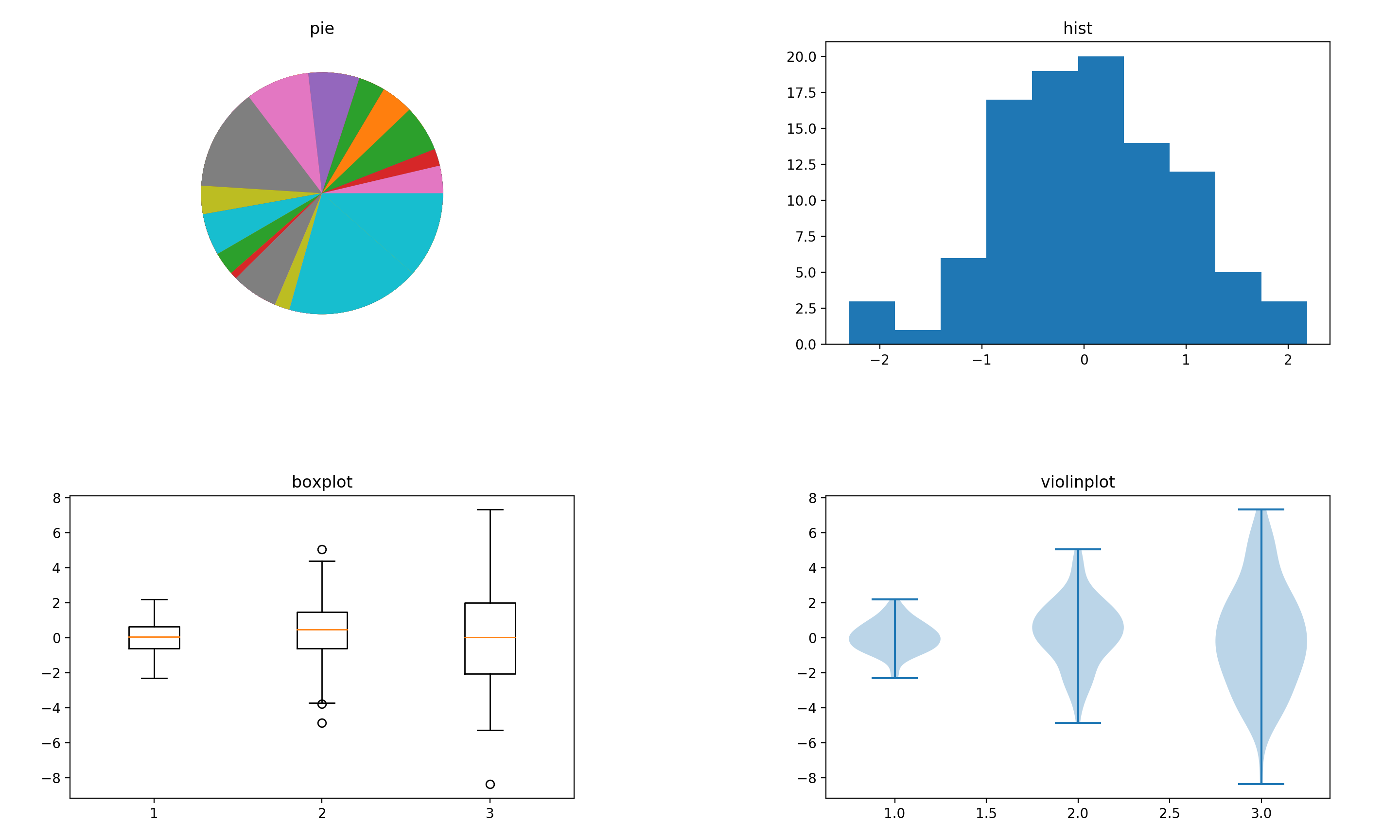
Axes.pie |
饼图,可以反映每个种类的数据占的百分比 | |
Axes.hist |
直方图,可以反映数据分布情况,一般横坐标是数值区间,纵坐标是频数 | |
Axes.boxplot |
箱型图,可以反映数据的上边缘、下边缘、中位数、两个四分位数和异常值 | 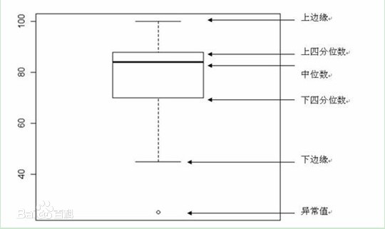 |
Axes.violinplot |
小提琴图,可以反映数据分布情况及其概率密度 | 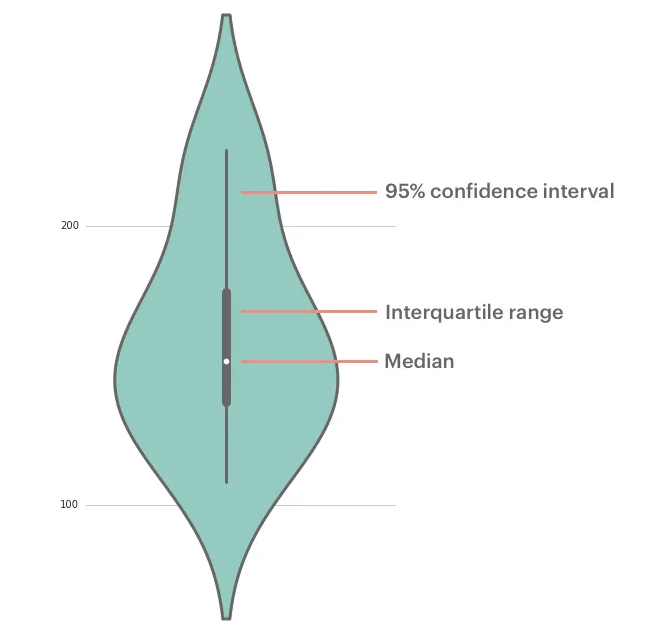 |
2.3. 多标签统计图
def multiple_labels():
    height = 2
    width = 2

    point = 20

    x = np.linspace(0, 10, point)
    y = x
    y1 = x[::-1]
    width_ = 0.2

    fig, axs = plt.subplots(height, width)

    n = iter([(i, j) for i in range(height) for j in range(width)])

    ax = axs[next(n)]
    ax.set_title('叠加')
    ax.bar(x, y, width_, label='bar1')
    ax.bar(x, y1, width_, bottom=y, label='bar2')
    ax.legend()

    ax = axs[next(n)]
    ax.set_title('错峰')
    ax.bar(x - width_ / 2, y, width_, label='bar1')
    ax.bar(x + width_ / 2, y1, width_, label='bar2')
    ax.legend()

    ax = axs[next(n)]
    ax.set_title('交替')
    ax.bar(x[range(0, point, 2)], y[range(0, point, 2)], width_, label='bar1')
    ax.bar(x[range(1, point, 2)], y[range(1, point, 2)], width_, label='bar2')
    ax.legend()

    ax = axs[next(n)]
    ax.set_title('共享')
    from matplotlib.legend_handler import HandlerTuple
    y2 = np.ones_like(x)
    b1 = ax.bar(x, y2, width_)
    b2 = ax.bar(x, y, width_, bottom=y2)
    b3 = ax.bar(x, y1, width_, bottom=y + y2)
    ax.legend([(b1, b2), b3], ['label1', 'label2'], handler_map={tuple: HandlerTuple(ndivide=None)})

    plt.show()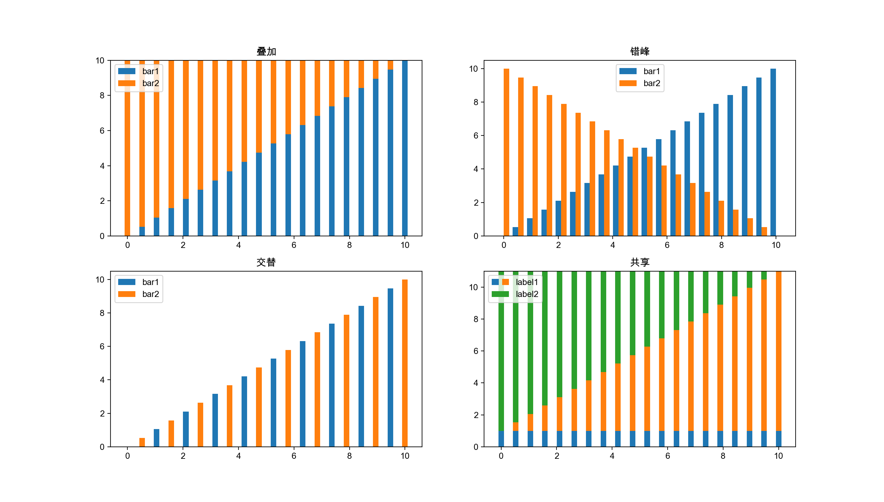
2.4. 多坐标统计图
2.4.1. 单一标签对应多坐标
| 函数名 | 作用 |
|---|---|
Axes.secondary_xaxis |
添加一个辅助x轴 |
Axes.secondary_yaxis |
添加一个辅助y轴 |
这里面的function的参数令我很困惑,这个参数需要春如两个方程——一个正向函数和一个反向逆函数,其中,第二个反向逆函数好像并不起作用,你可以传入一个任意的方程,最终结果都是一样的
def secondary_yaxis():
    x = np.linspace(0, 10, 50)
    y = np.exp(x)
    fig, ax = plt.subplots()
    ax.plot(x, y)
    ax.secondary_yaxis('right', functions=(lambda a: 10 * a, lambda a: a / 10))
    plt.show()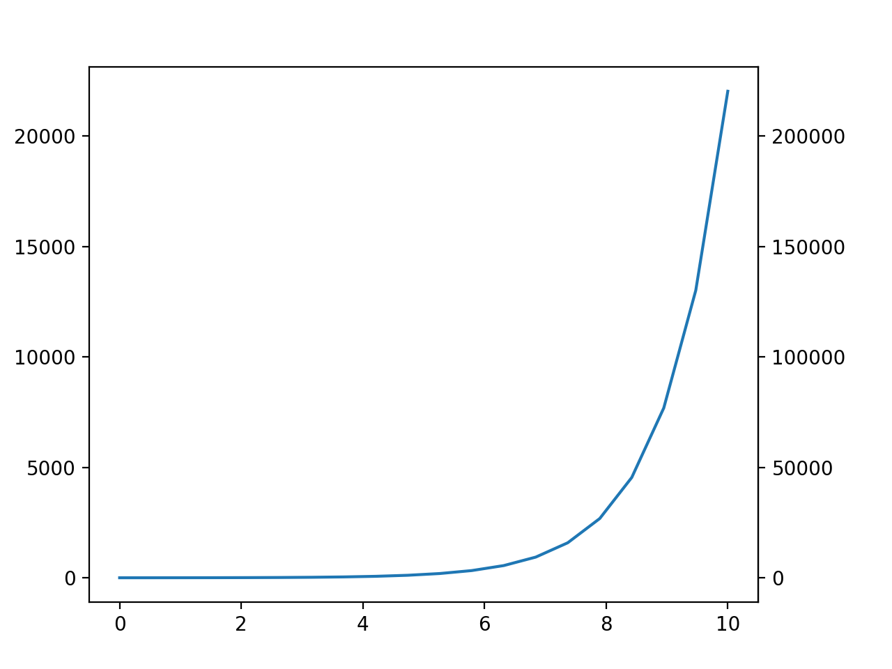
2.4.2. 多标签对应多坐标
| 函数名 | 作用 |
|---|---|
Axes.twinx |
生成一个共享x轴的axes |
Axes.twiny |
生成一个共享y轴的axes |
def multiple_yaxis():
    height = 1
    width = 2

    point = 50

    x = np.linspace(0, 10, point)
    y = np.exp(x)
    y1 = np.sin(x)
    y2 = 1 / x

    fig, axs = plt.subplots(height, width, squeeze=False)
    plt.subplots_adjust(left=0.1, right=0.85, bottom=0.1, top=0.9, wspace=0.5, hspace=0.5)

    n = iter([(i, j) for i in range(height) for j in range(width)])

    ### 两个标签对应两个坐标轴 ###
    ax = axs[next(n)]
    ax.set_title('两个标签对应两个坐标轴')
    color = 'r'
    l1, = ax.plot(x, y, label='y=exp(x)', color=color)
    ax.set_ylabel('exp', color=color)
    ax.tick_params(axis='y', labelcolor=color)

    # 添加第二个坐标轴
    ax1 = ax.twinx()
    color = 'b'
    l2, = ax1.plot(x, y1, label='y=sin(x)', color=color)
    ax1.set_ylabel('sin', color=color)
    ax1.tick_params(axis='y', labelcolor=color)

    # 添加标签
    lines = [l1, l2]
    ax.legend(lines, [l.get_label() for l in lines], loc='upper center')

    ### 三个标签对应三个坐标轴 ###
    ax = axs[next(n)]
    ax.set_title('三个标签对应三个坐标轴')
    color = 'r'
    l1, = ax.plot(x, y, label='y=exp(x)', color=color)
    ax.set_ylabel('exp', color=color)
    ax.tick_params(axis='y', labelcolor=color)

    # 添加第二个坐标轴
    ax1 = ax.twinx()
    color = 'b'
    l2, = ax1.plot(x, y1, label='y=sin(x)', color=color)
    ax1.set_ylabel('sin', color=color)
    ax1.tick_params(axis='y', labelcolor=color)

    # 添加第三个坐标轴
    # 其原理是再添加一个twinx的axes,然后把右边框往右边挪一点,错开第二个坐标轴
    ax2 = ax.twinx()
    color = 'g'
    l3, = ax2.plot(x, y2, label='y=1/x', color=color)
    ax2.tick_params(axis='y', labelcolor=color)
    ax2.set_ylabel('1/x', color=color)
    ax2.spines["right"].set_position(("axes", 1.2))

    # 添加标签
    lines = [l1, l2, l3]
    ax.legend(lines, [l.get_label() for l in lines], loc='upper center')

    plt.show()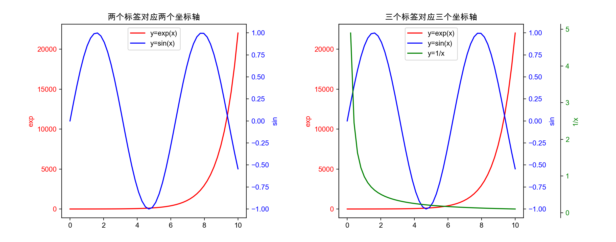
2.5. 辅助图形部件
| 函数名 | 作用 |
|---|---|
Axes.axhline |
作一条 x=n 的垂直线 |
Axes.axhspan |
作一个 [ymin, ymax, xmin=0, xmax=1] 的矩形 |
Axes.axvline |
作一条 y=n 的水平线 |
Axes.axvspan |
作一个 [xmin, xmax, ymin=0, ymax=1] 的矩阵 |
Axes.annotate |
给指定点作注释 |
Axes.text |
在指定位置上添加文本 |
Axes.table |
添加一个表格 |
Axes.arrow |
以指定位置为起始点,作一个指定方向的箭头 |
Axes.inset_axes |
画像中添加一个子图 |
Axes.indicate_inset_zoom |
添加指示区间,指示子图出自原图的哪一处 |
Figure.colorbar |
添加一个调色板 |
2.6. 二维数组图像
| 函数名 | 作用 |
|---|---|
Axes.imshow |
基于RGB数组,生成一个二维数组图像 |
Axes.pcolor |
指定网格数组和RGB数组,生成一个二维数组图像 |
def array_image():
    height = 1
    width = 3

    xx, yy = np.mgrid[-3:3:100j, -2:2:100j]
    zz = xx ** 2 + yy * 2
    zz = zz[:-1, :-1]  # xx.shape -> (100, 100), yy.shape -> (100, 100), zz.shape -> (99, 99)

    fig, axs = plt.subplots(height, width, squeeze=False)

    n = iter([(i, j) for i in range(height) for j in range(width)])

    ax = axs[next(n)]
    ax.set_title('imshow')
    ax.imshow(zz)

    ax = axs[next(n)]
    ax.set_title('pcolor(without grid)')
    ax.pcolor(zz)

    ax = axs[next(n)]
    ax.set_title('pcolor(with grid)')
    ax.pcolor(yy, xx, zz)

    plt.show()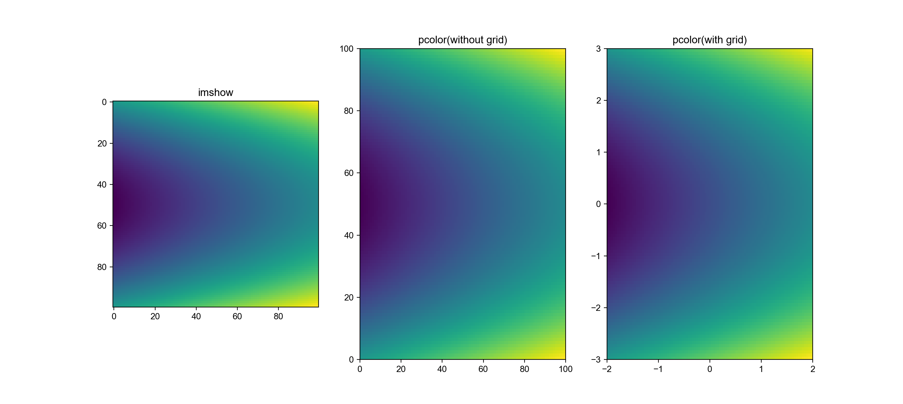
3. 三维图像
3.1. 3D画像
| 函数名 | 作用 |
|---|---|
Axes3D.plot |
2维折线图 |
Axes3D.scatter |
3维散点图 |
Axes3D.bar |
2维条形图 |
Axes3D.bar3d |
3维条形图 |
Axes3D.voxeis |
3维填充图 |
Axes3D.plot_surface |
3维表面图 |
Axes3D.plot_wireframe |
3维网格图 |
Axes3D.contour |
3维等高线 |
Axes3D.contourf |
3维等高面 |
创建一个3d图像的语句如下
import mpl_toolkits.mplot3d  # 这个模块是一定要导的,即使后面没引用这个模块

x = np.linspace(-5, 5, point)
y = np.linspace(-5, 5, point)
xx, yy = np.meshgrid(x, y)
zz = np.sin(np.sqrt(xx ** 2 + yy ** 2))

fig = plt.figure()
ax3d = fig.add_subplot(projection='3d')
ax3d.plot_surface(xx, yy, zz)
ax3d.view_init(25, 45)  # 选择角度
plt.show()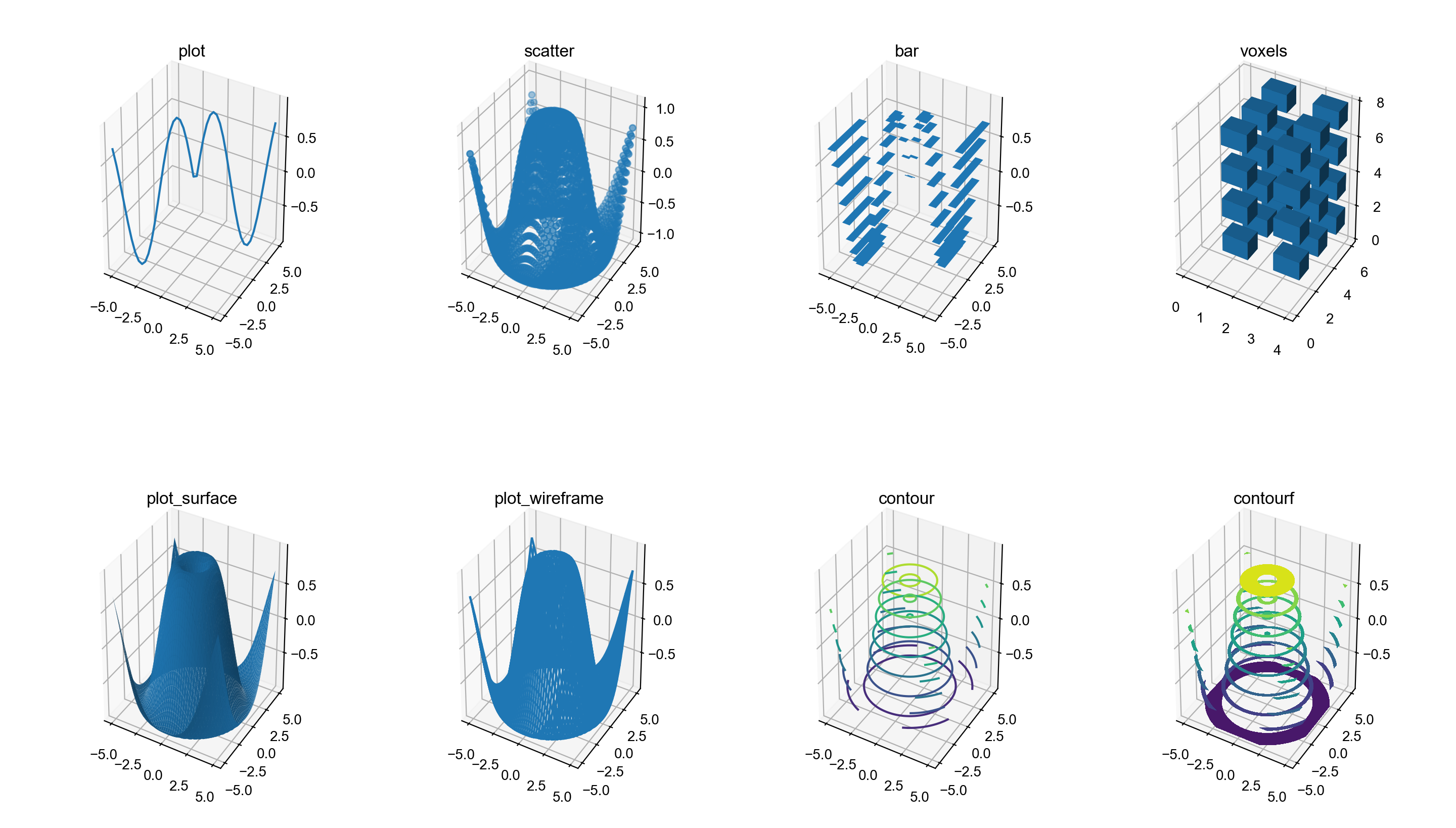
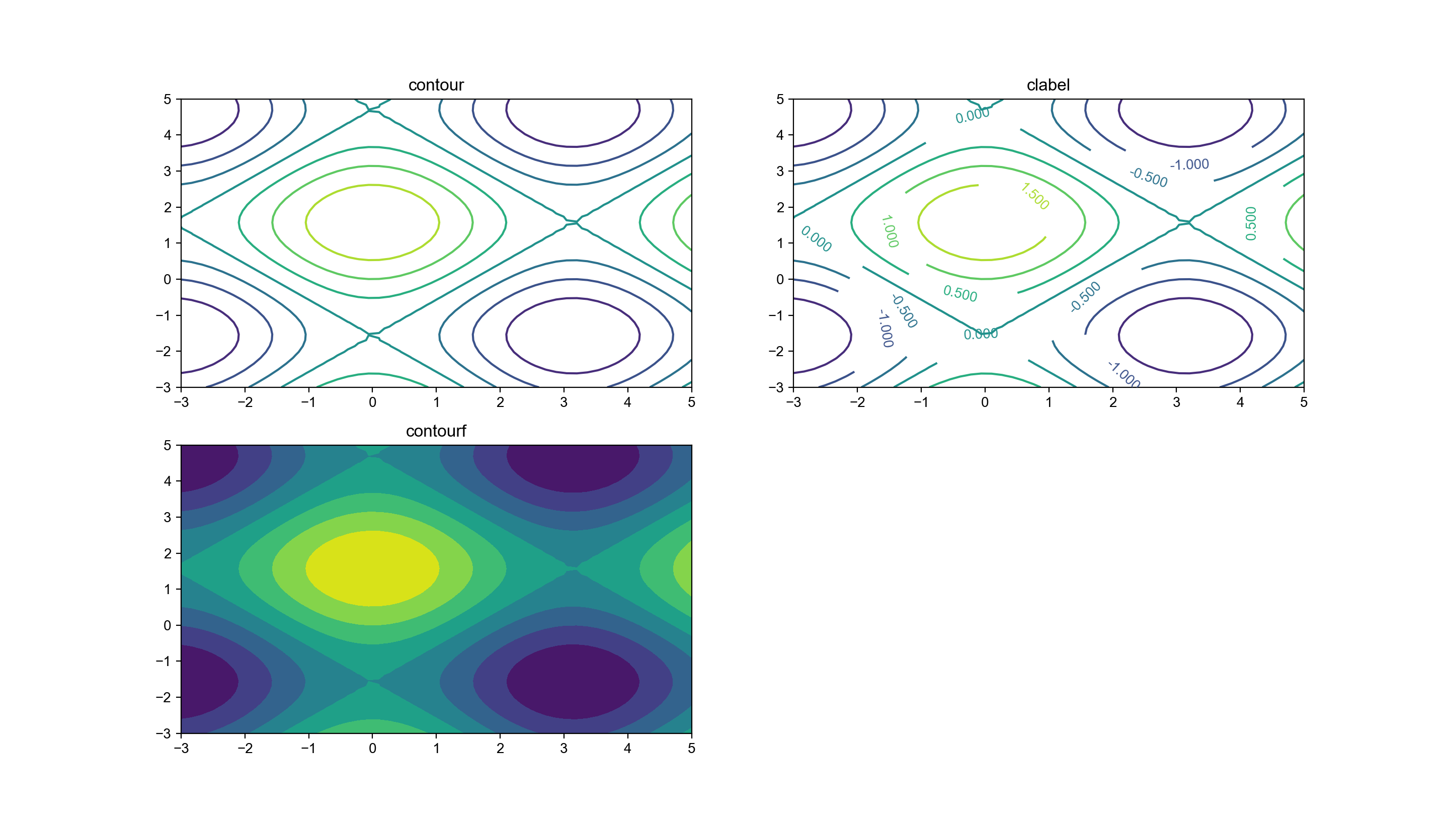
3.2. 等高线
理论上这个属于二维画像,但实际上,这只是3D画像往一个面上(例如xy面)压平的结果,所以也归到这一类中了。
| 函数名 | 作用 |
|---|---|
Axes.clabel |
添加等高线数值 |
Axes.contour |
等高线 |
Axes.contourf |
等高面 |
下面只截取等高线数值的添加代码
def contour():
    height = 2
    width = 2
    point = 50

    x = np.linspace(-3, 5, point)
    y = np.linspace(-3, 5, point)
    xx, yy = np.meshgrid(x, y)
    zz = np.sin(yy) + np.cos(xx)

    n = iter([(i, j) for i in range(height) for j in range(width)])
    ...
    ax = axs[next(n)]
    ax.set_title('clabel')
    cs = ax.contour(xx, yy, zz)
    ax.clabel(cs)
    ...
    plt.show()
4. 动画
| 函数名 | 作用 |
|---|---|
FuncAnimation |
输入的是一个function函数或者一个具有回调函数的对象 |
ArtistAnimation |
输入的是一个ax列表 |
生成动画例子
def animation():
    import matplotlib.animation as animation

    fig, ax = plt.subplots()

    r = 1
    t = np.linspace(-np.pi, np.pi, 60)

    line, = ax.plot([], [])
    ax.set_ylim([-1.5, 1.5])
    ax.set_xlim([-1.5, 1.5])

    # FuncAnimation
    def func(i):
        x = r * np.cos(t[i:i + 10])
        y = r * np.sin(t[i:i + 10])
        line.set_data(x, y)
        return (line,)

    def init():
        line.set_data([], [])
        return (line,)

    ani = animation.FuncAnimation(fig, func, len(t) - 10,
                                  blit=True, # 是否只更新变化的点,建议选Ture,不然有时候会显示不出图像
                                  init_func=init, # 指定初始化函数,这个参数不设置的话,会自动多运行一次func作为初始化
                                  interval=50, # 延迟n ms更新一次图像
                                  repeat=True, # 是否重复
                                  repeat_delay=50 # 重复更新延迟
                                  )

    # ArtistAnimation
    ims = []
    for i in range(len(t) - 10):
        x = r * np.cos(t[i:i + 10])
        y = r * np.sin(t[i:i + 10])
        line, = ax.plot(x, y, color='b')
        ims.append(func(i))

    ani = animation.ArtistAnimation(fig, ims,
                                    interval=50,
                                    repeat=True,
                                    repeat_delay=50
                                    )

    # 如果保存为gif,就用ImageMagickWriter,如果是像mp4这种媒体流文件,就用FFMpegWriter
    # fps要在初始化Writer时定义,不然会报错
    from matplotlib.animation import ImageMagickWriter as Writer
    ani.save('animation.gif', writer=Writer(fps=50))

    from matplotlib.animation import FFMpegWriter as Writer
    ani.save('animation.mp4', writer=Writer(fps=50))

plt.show()FuncAnimation的每一帧都是实时的,内存压力较小。
ArtistAnimation会把整个动画的每一帧保存在内存中,如果动画循环播放,就可以减少重复计算时间,而且从程序设计的角度,这种方式更加灵活,所以,我一般都选择这种方法。
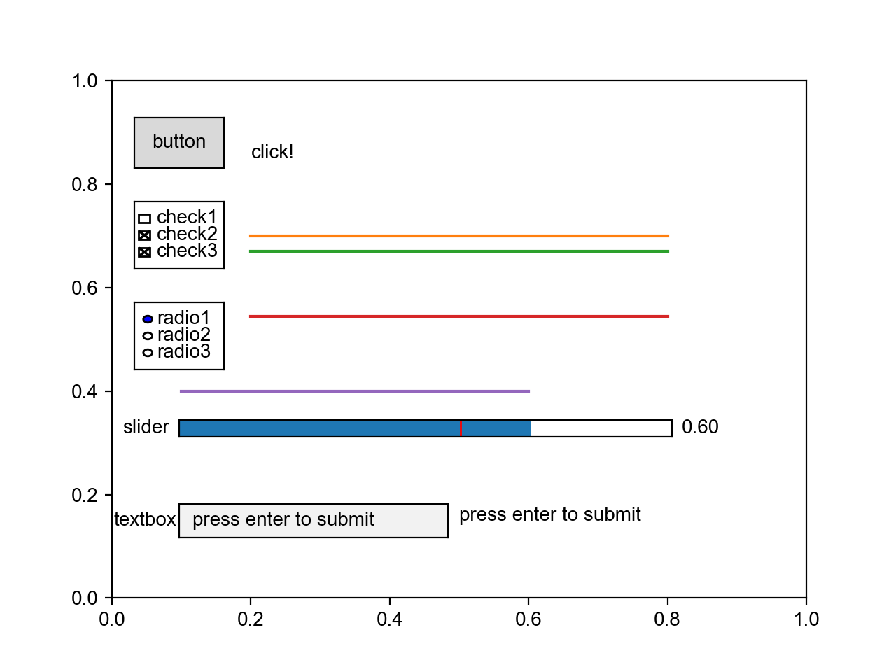
5. GUI控件
| 函数名 | 作用 |
|---|---|
widgets.Button |
按钮 |
widgets.CheckButtons |
复选框 |
widgets.RadioButtons |
单选框 |
widgets.Cursor |
鼠标处显示十字光标 |
widgets.Slider |
滑动条 |
widgets.TextBox |
文本框 |
def gui():
    import matplotlib.widgets as widgets

    fig, ax = plt.subplots()
    ax.set_xlim([0, 1])
    ax.set_ylim([0, 1])

    # Button
    def btn_click(event):
        ax.text(0.2, 0.85, 'click!')
        plt.draw()

    ax_btn = fig.add_axes([0.15, 0.75, 0.1, 0.075])
    btn = widgets.Button(ax_btn, 'button')
    btn.on_clicked(btn_click)

    # CheckButtons
    x = np.linspace(0.2, 0.8, 10)
    l0, = ax.plot(x, np.zeros_like(x) + 0.73, visible=False, label='check1')
    l1, = ax.plot(x, np.zeros_like(x) + 0.7, label='check2')
    l2, = ax.plot(x, np.zeros_like(x) + 0.67, label='check3')
    lines = [l0, l1, l2]
    labels = [str(line.get_label()) for line in lines]
    visibility = [line.get_visible() for line in lines]

    def check_click(label):
        index = labels.index(label)
        lines[index].set_visible(not lines[index].get_visible())
        plt.draw()

    ax_check = fig.add_axes([0.15, 0.6, 0.1, 0.1])
    check = widgets.CheckButtons(ax_check, labels, visibility)
    check.on_clicked(check_click)

    # RadioButtons
    l, = ax.plot(x, np.zeros_like(x) + 0.545)
    r_dic = {'radio1': 0.545, 'radio2': 0.51, 'radio3': 0.475}

    def radio_click(label):
        l.set_data(x, np.zeros_like(x) + r_dic[label])
        plt.draw()

    ax_radio = fig.add_axes([0.15, 0.45, 0.1, 0.1])
    radio = widgets.RadioButtons(ax_radio, r_dic.keys())
    radio.on_clicked(radio_click)

    # Cursor
    # cursor = widgets.Cursor(ax, useblit=True, color='red', linewidth=2)

    # Slider
    x_slide = np.linspace(0.1, 0.5)
    l_slide, = ax.plot(x_slide, np.zeros_like(x_slide) + 0.4)

    def slide_update(val):
        x_slide = np.linspace(0.1, val)
        l_slide.set_data(x_slide, np.zeros_like(x_slide) + 0.4)
        plt.draw()

    ax_slide = fig.add_axes([0.2, 0.35, 0.55, 0.025])
    slider = widgets.Slider(ax_slide, 'slider', 0.1, 0.8, valinit=0.5, valstep=0.1)
    slider.on_changed(slide_update)

    # TextBox
    txt = ax.text(0.5, 0.15, '')

    def textbox_submit(text):
        txt.set_text(text)
        plt.draw()

    ax_textbox = fig.add_axes([0.2, 0.2, 0.3, 0.05])
    textbox = widgets.TextBox(ax_textbox, 'textbox', initial='press enter to submit')
    textbox.on_submit(textbox_submit)

    plt.show()